Skip to content
When Brothers Desserts joined forces with Schoep’s Ice Cream there were several things apparent:
-
Schoep’s Ice Cream was a heritage brand with some legacy fans going back generations.
-
They play in the sandbox of nostalgia. So many people have fond memories of Schoep’s, but many are left wondering where did Schoep’s go?
-
Visually the company needed a refresh.
With those tidbits and directives we got to work. We wanted to re-do everything. Our design team did a deep dive into artisan and corporate ice cream companies. Logo structure and Consumer Packaged Goods trends. We wanted to be classic, timeless and fun. We wanted to bring the joy back to Schoep’s.
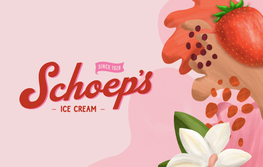
For the logo we wanted a throwback, something in cursive that felt like it was designed generations ago. After multiple iterations we landed on our final approved logo. Form there we started on our package redesign. No small task considering the amount of products and flavors we make! We decided that “color" was going to be our approach. We wanted pastels and a dreamy look. We also wanted delicious shots of our ice cream front and center, jumping off the package.
So over the past 6 months, with a thousand other twists and turns, is basically how we got to our new look and our new packaging. What do you think? Let us know at info@schoeps.us
Thanks for the support!
Joshua W.
Head of Marketing
Use left/right arrows to navigate the slideshow or swipe left/right if using a mobile device
- Choosing a selection results in a full page refresh.
- Press the space key then arrow keys to make a selection.

